Fhenix Design System
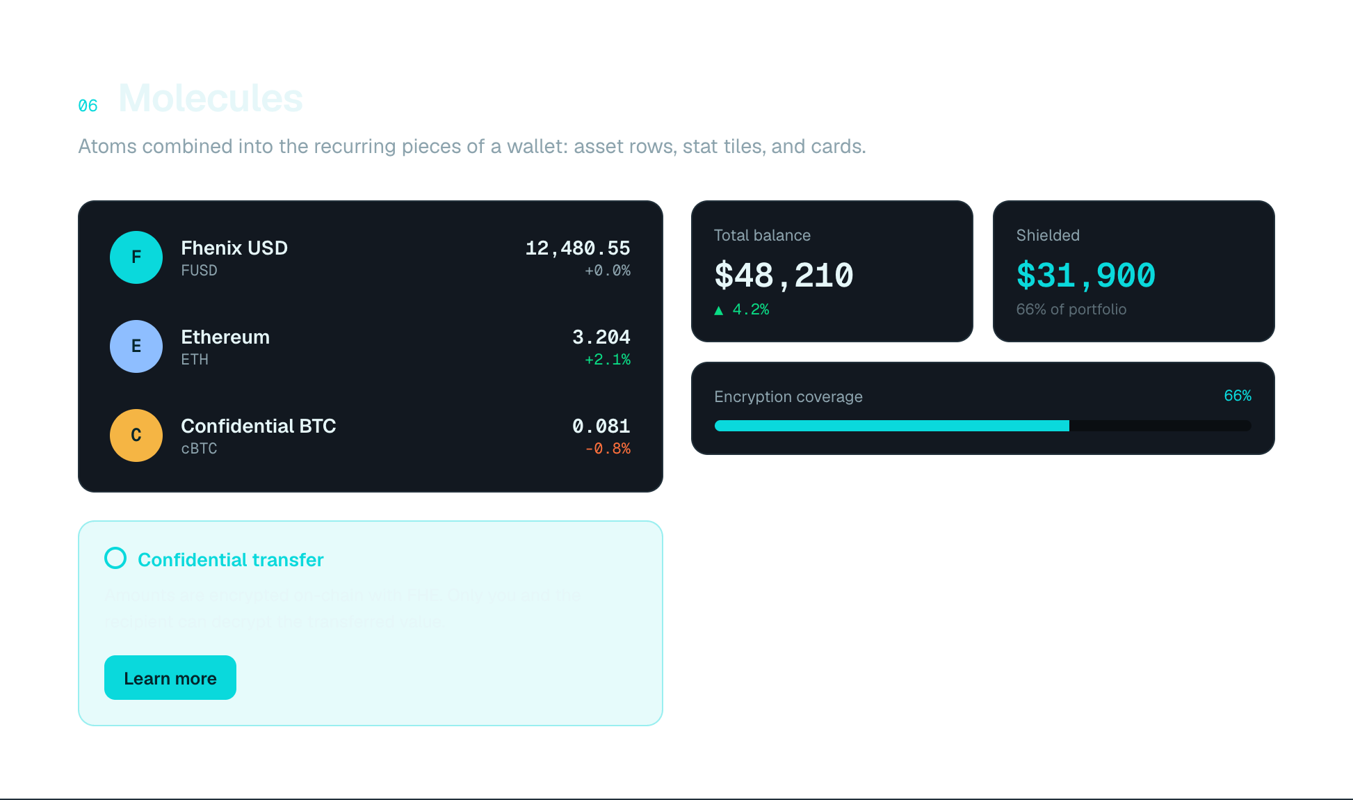
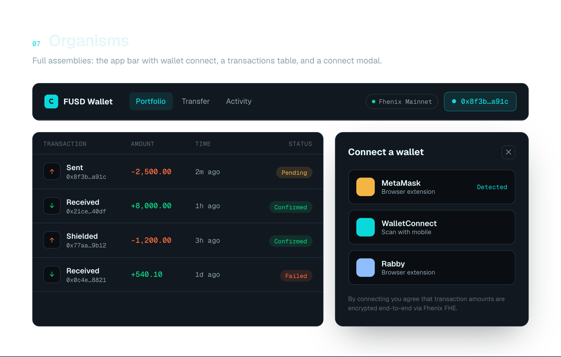
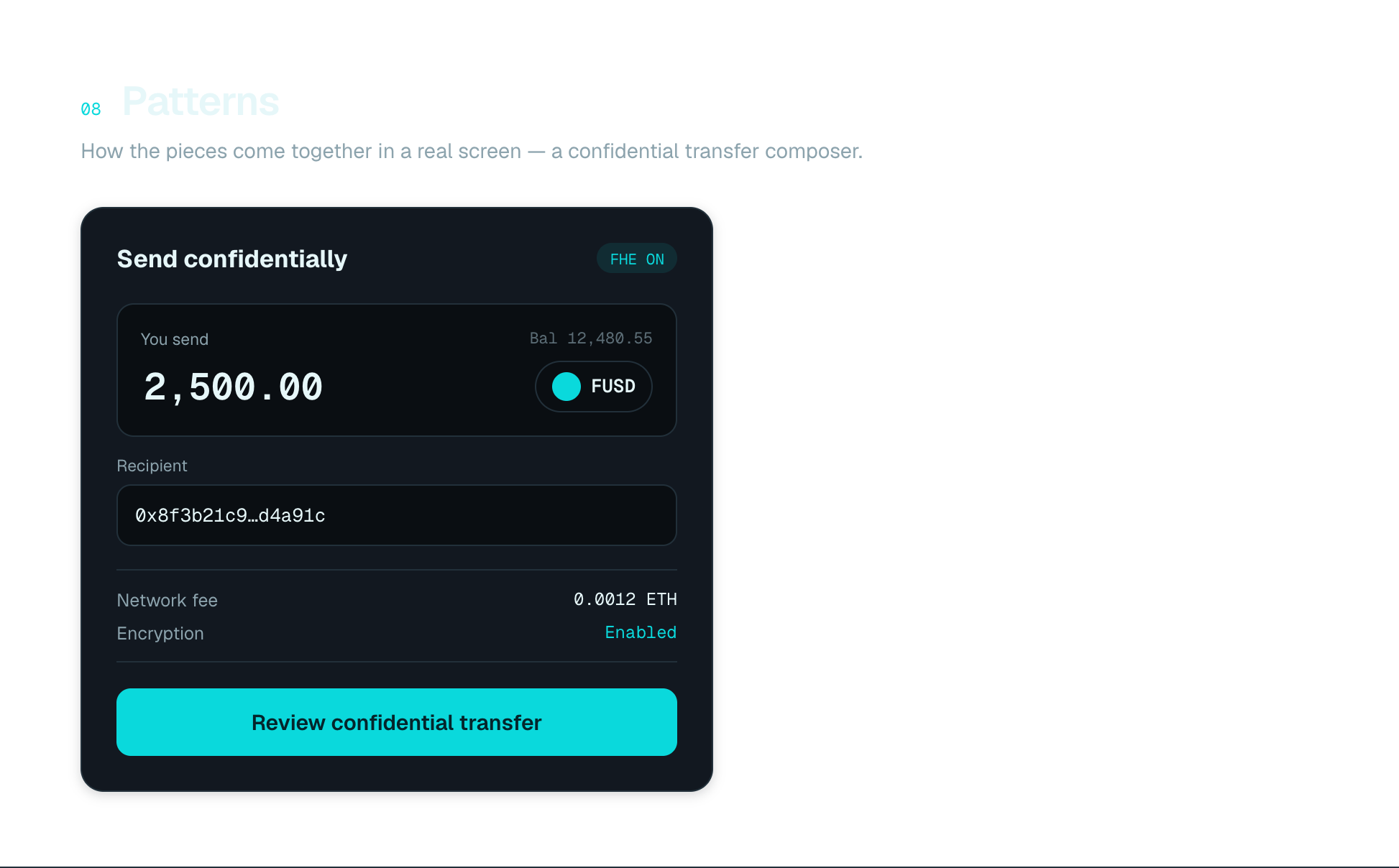
Cypher — the design system for Fhenix that makes confidential on-chain experiences (CoFHE) legible and consistent — tokens, components and patterns that bring clarity to complex cryptographic interactions.

Confidential computing on-chain (FHE) is powerful but intimidating; each product screen risked reinventing patterns and drifting from brand.
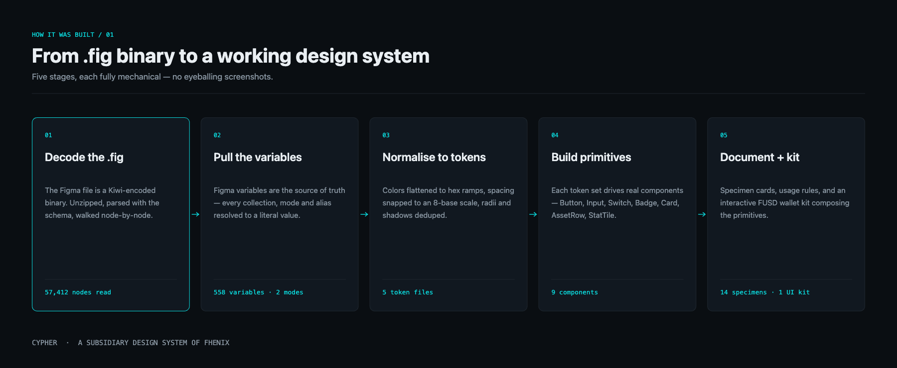
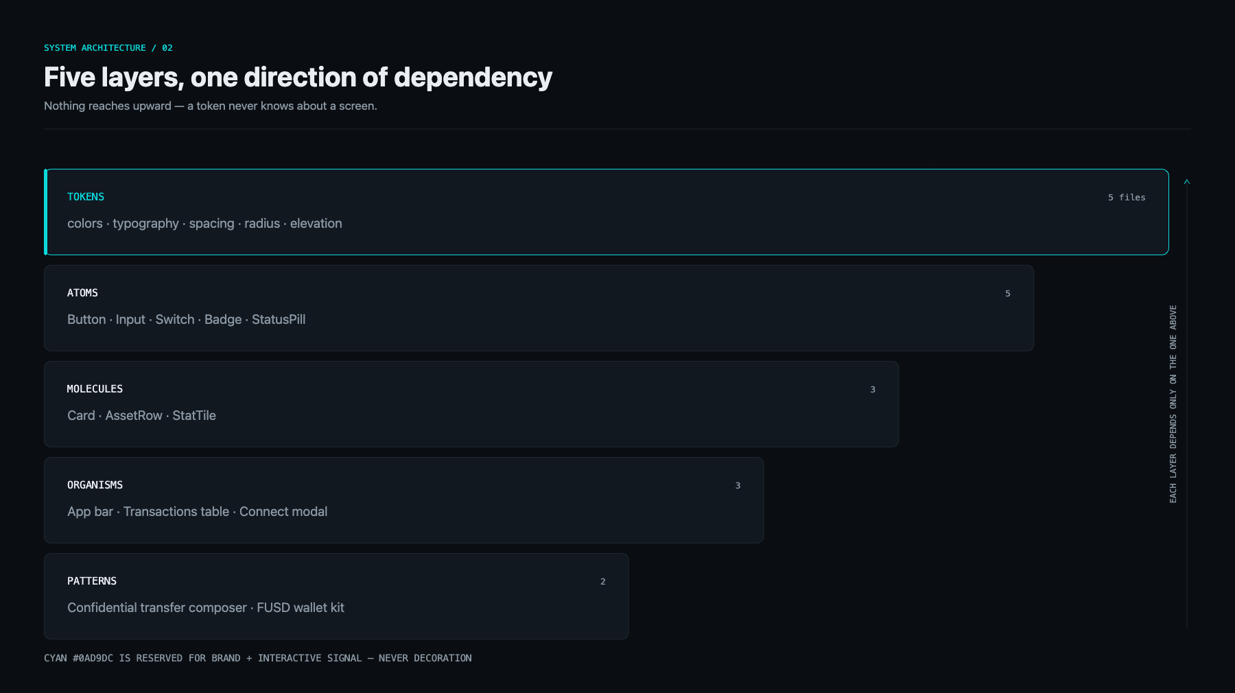
A single token-based system — color, type, spacing, components and interaction patterns — documented and reusable across every Fhenix surface.
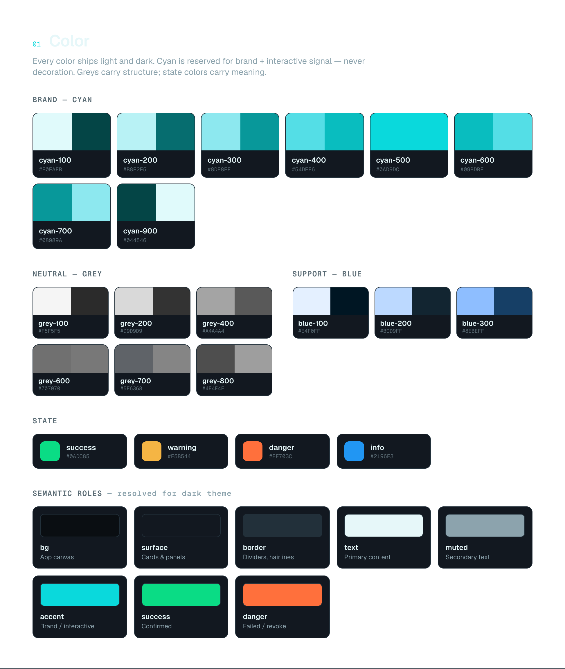
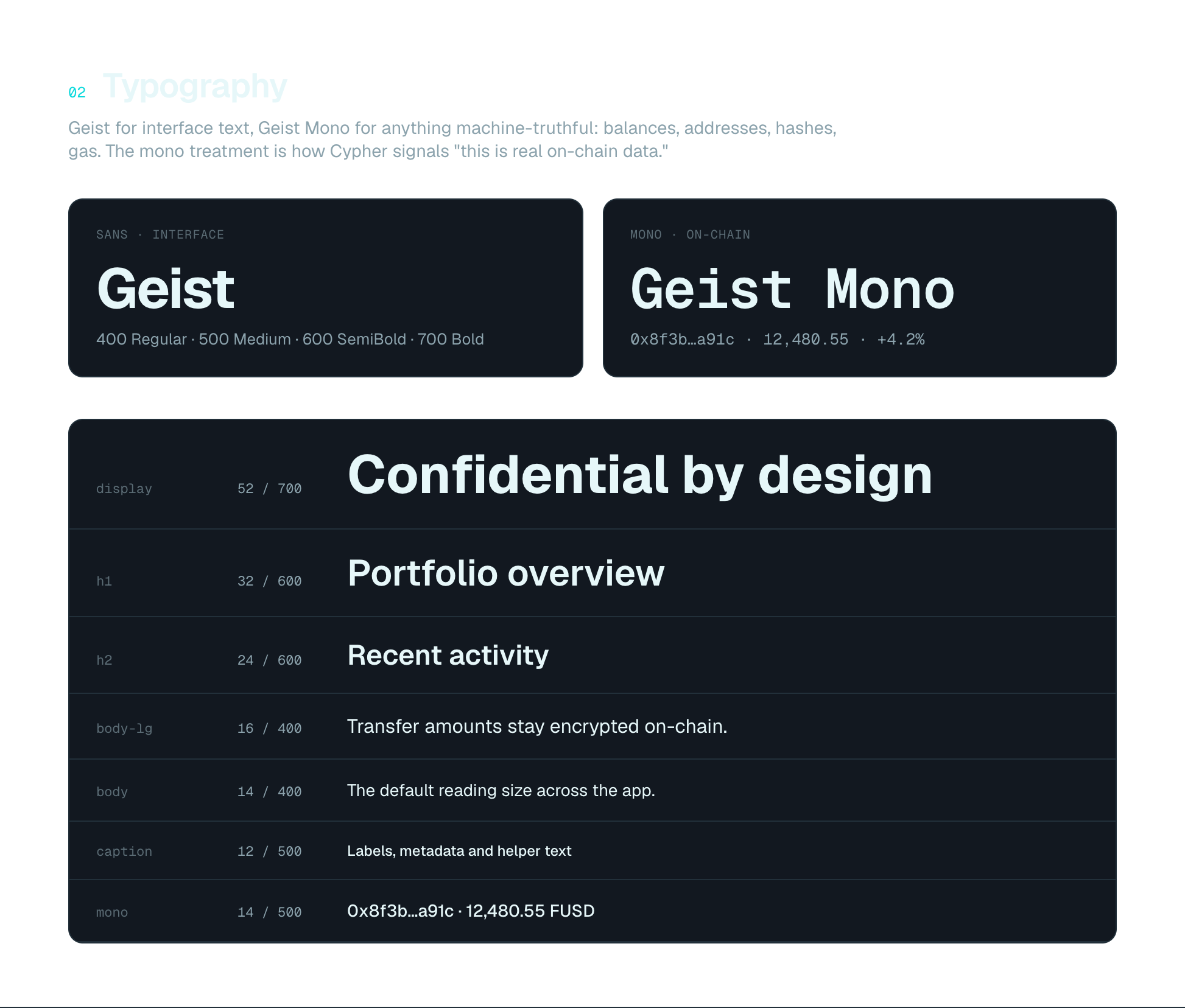
Accent-driven dark palette; Archivo + JetBrains Mono; reversible encrypt/decrypt states as a first-class pattern; progressive disclosure of cryptographic detail.
A consistent, scalable foundation adopted across Fhenix product and brand.
Three decisions that shaped the product — what the alternative was, and what each choice cost.
Cyan is signal, never decoration
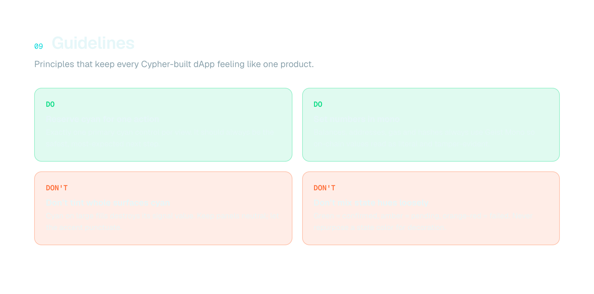
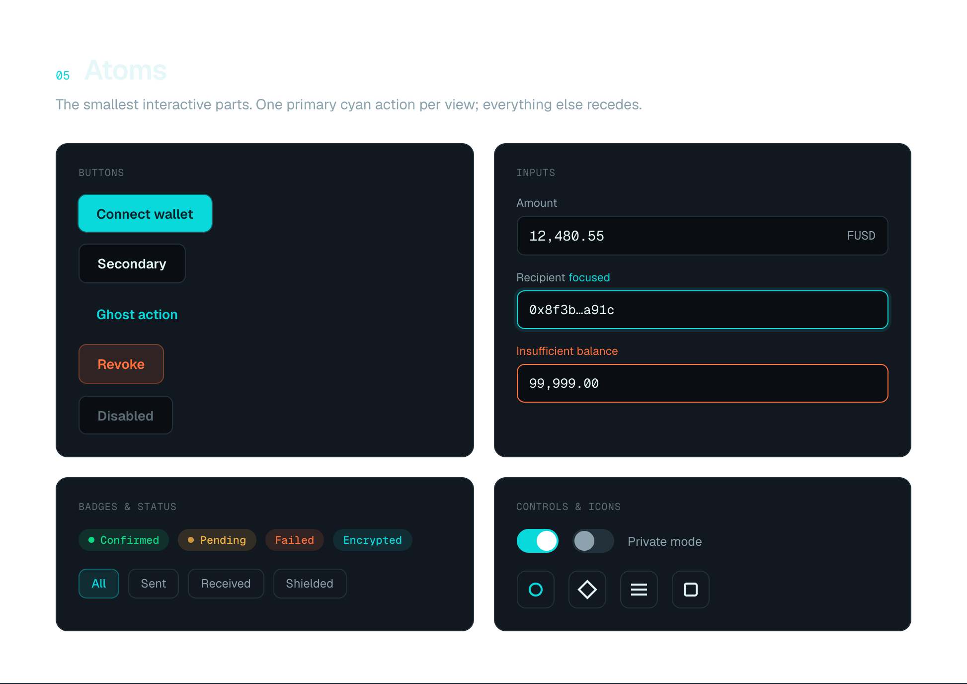
The obvious move is to paint the accent everywhere — buttons, headings, borders — so the product looks on-brand. In a confidential product that is dangerous: if cyan means "Fhenix" it cannot also mean "this value is encrypted". I reserved it for one job only, so a single glance at any screen tells you what is protected and what is exposed.
Cost: screens look quieter and less obviously branded than a competitor’s, and every new component has to justify using the accent at all — a rule the team has to police in review, forever.
Monospace for every number
Two families is more to maintain than one. But encrypted balances change width as they resolve, and in a proportional face the digits jitter while amounts settle — which reads as instability in the exact moment a user needs to trust the number. Tabular mono keeps every figure on a fixed grid: values update without the layout twitching.
Cost: a second family to load and pair, and mono at small sizes is less comfortable to read — so it had to be strictly limited to data, never prose.
Tight radii — instruments, not soft cards
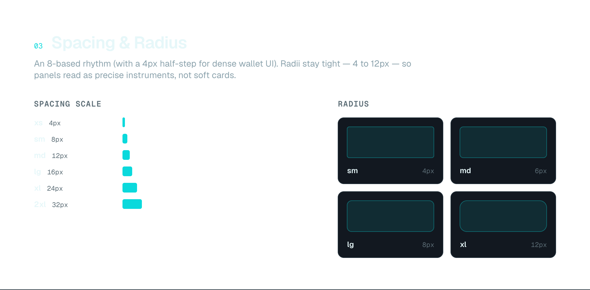
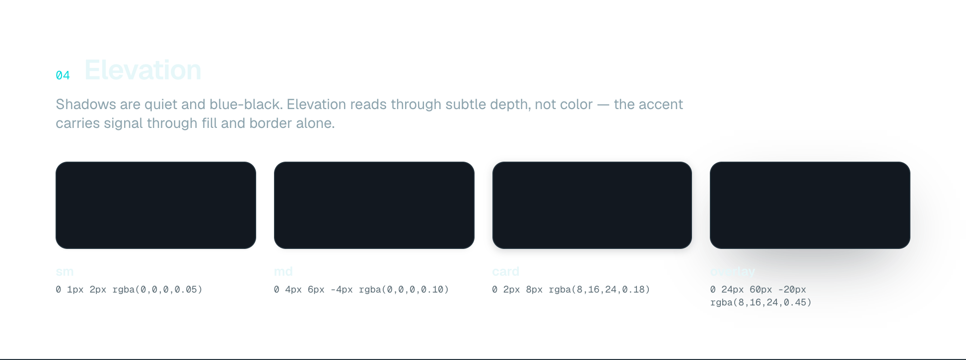
Generous rounding is the current default and it reads as friendly and safe. This is financial cryptography: people are moving real value through an operation they cannot visually verify. Tight radii and a restrained elevation scale make the interface feel like an instrument that reports state, rather than a consumer app asking to be trusted on vibes.
Cost: it reads as colder and more expert-facing, which raises the bar for onboarding — a first-time user gets less visual reassurance and needs the copy to do that work instead.
Open in the interactive portfolio →